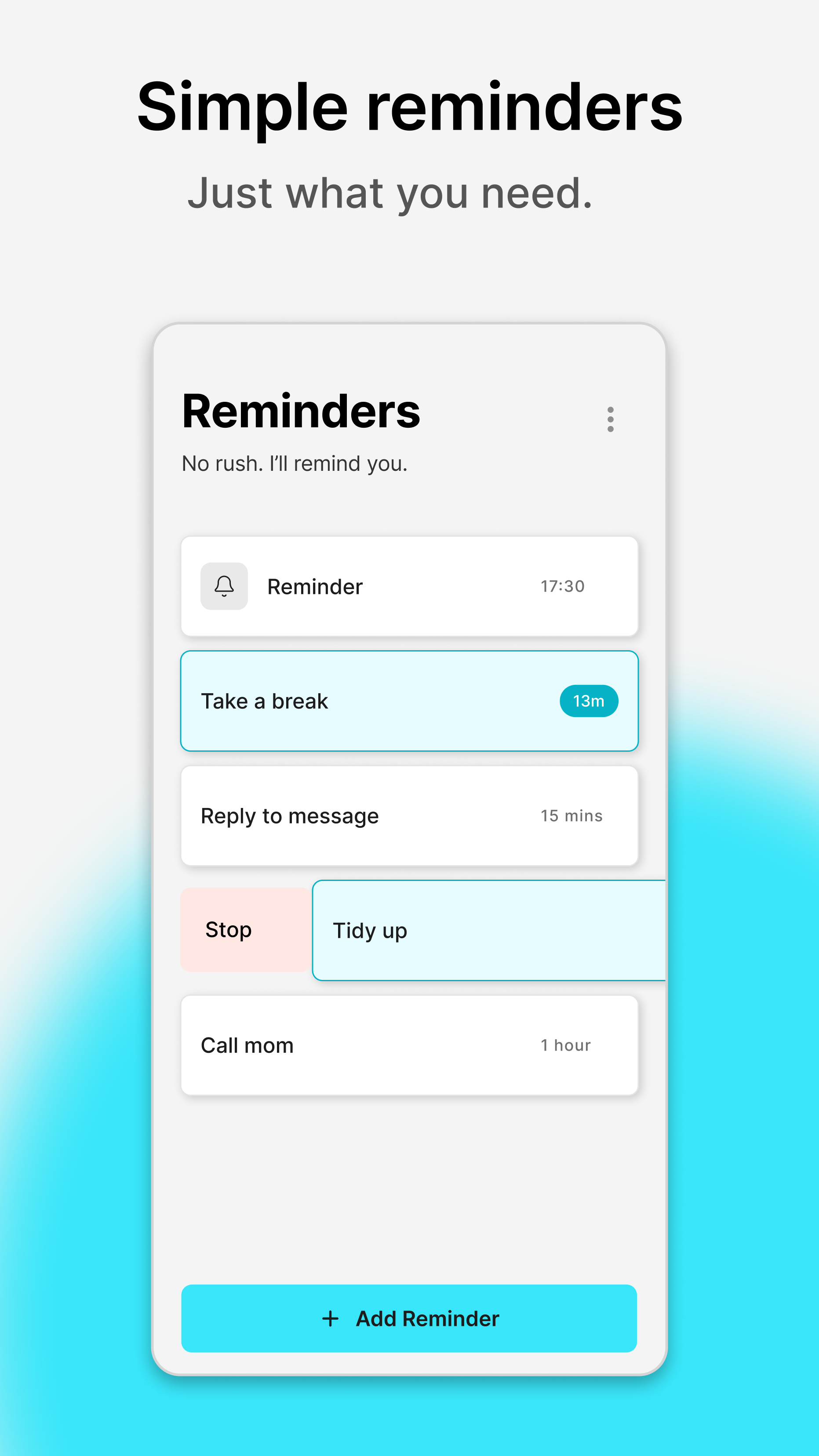
Soonish

Solo developer · 2026
Mobile App Flutter

Soonish is a minimal reminder app built to reduce the friction of setting short, time-based reminders. Reminders are intentionally limited to the next 24 hours and can be created in seconds using preset times and swipe interactions. The project prioritizes interaction efficiency and cognitive simplicity over feature breadth.

Intent

What This Is

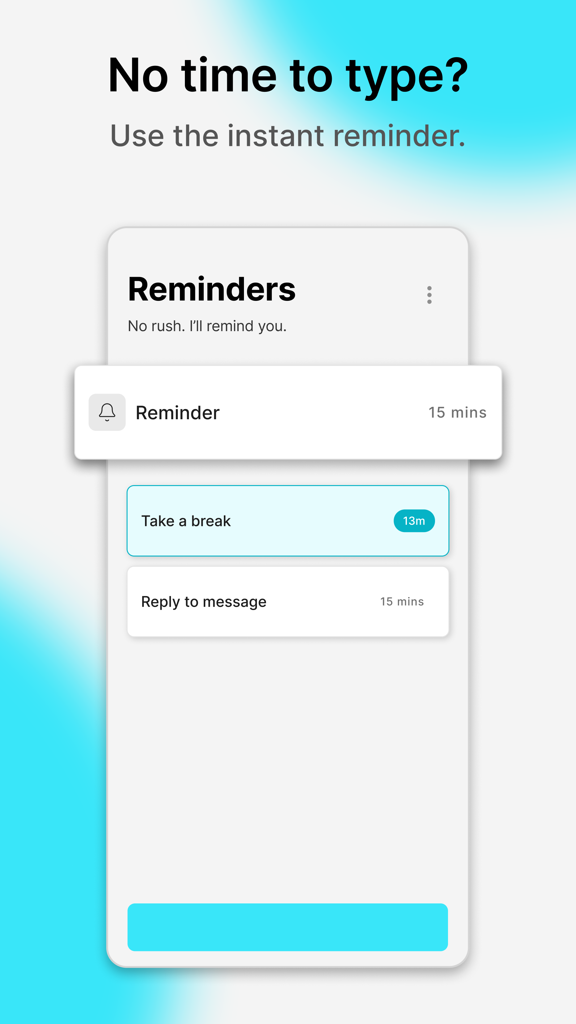
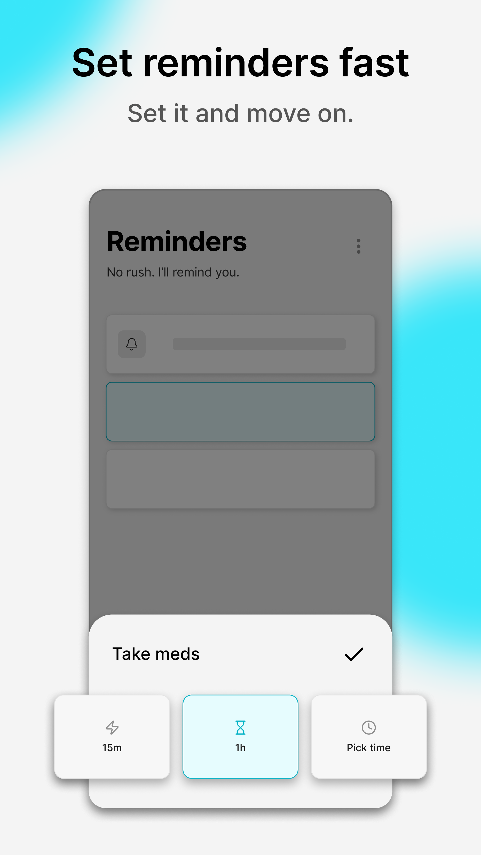
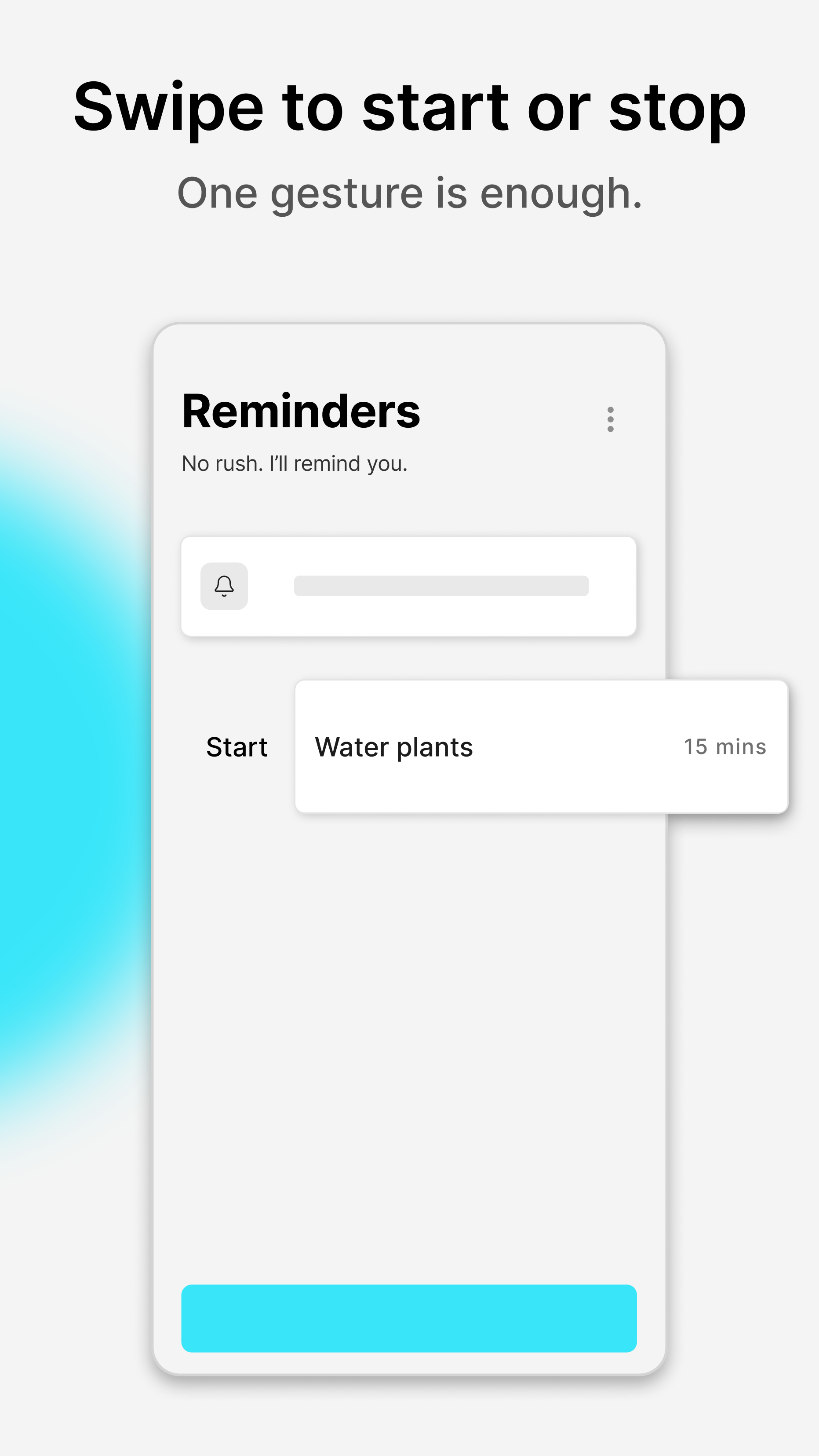
Soonish is a lightweight utility designed for quick reminders such as short breaks, temporary tasks, or time-based nudges. It removes categories, accounts, and complex scheduling to keep the core action fast and predictable.

What This Is Not

This is not a task management system or long-term planning tool. It does not aim to replace calendar apps or productivity platforms. The scope is intentionally narrow to protect speed and clarity.

What I Practiced

This project focused on reducing interaction cost to the absolute minimum. I explored how few decisions a user needs to make before completing an action and how interface structure influences perceived effort.

  • Designing for simplicity without making the interface feel empty
  • Reducing interaction cost to the absolute minimum
  • Creating calm notification behavior instead of urgent alerts
  • Shipping a focused utility app end-to-end in Flutter

Philosophy & Design Decisions

Reminders Should Be Lighter Than the Task

The core principle behind Soonish is that setting a reminder should require less effort than completing the task itself. Preset time options, optional text input, and direct swipe actions were implemented to reduce both typing and navigation steps.

Speed Over Features

Instead of expanding into recurring schedules, tagging systems, or cloud synchronization, the product prioritizes immediacy. Additional features were intentionally deferred to prevent increased setup time and cognitive load.

Deliberate Simplicity

The interface is intentionally minimal. Each feature is evaluated based on whether it supports the primary use case of quick reminder creation. This constraint helps maintain product clarity and prevents unnecessary complexity.

Interaction Design

Swipe to Act

Reminders can be started and stopped using a single swipe gesture. This interaction reduces reliance on buttons and menu navigation while keeping actions reversible and clear.

Tap and Go

The preset reminder tile enables immediate creation without typing. This reduces decision fatigue in situations where speed is more important than customization.

Calm Notification UX

Notifications remain visible until cleared rather than requiring immediate dismissal. This approach avoids urgency and allows reminders to function as passive prompts instead of interruptions.

Implementation Notes

Architecture

  • Built in Flutter
  • Local-only persistence
  • Lightweight state management focused on speed
  • No backend and no authentication layer

Product Tradeoffs

Cloud synchronization, recurring reminders, and advanced categorization were deliberately excluded from the first version. These additions would increase product weight and setup complexity. The current version prioritizes immediacy over extensibility.

Improvements & Reflection

Improvements

  • Refactor parts of the codebase for clearer separation between UI and logic
  • Explore optional recurring reminders without slowing the core flow
  • Strengthen micro-interactions to enhance perceived speed
  • Run small user tests to validate product decisions

Reflection

This project reinforced how difficult true simplicity can be. Reducing friction requires careful constraint rather than feature accumulation. I learned that clarity of scope often improves product coherence more than expanding capability.

Want to talk product philosophy, simplicity-first design, or speed-focused UX?

Let's connect